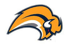
According to some news around the net, this is the new Buffalo Sabres logo for next year. I hate it and I think many other fans hate it as well. When I heard that the Sabres were going to go back to the blue and gold scheme, I was under the impression that it would be something reminiscent of the orignal Sabres logo with the buffalo and two sabres crossed. It was one of the few logos out there which you could literally read the team's name from the pictures. There are not many teams that could do that. Now we have a buffalo that looks very much like a flying slug or a really bad hairpiece. If you're a Sabres fan and you don't like the logo either, voice your opinion at www.fixthelogo.com. As of the publishing of this post, there are 20,000 Sabres fans who agree with me. I'm not sure if this will make any difference, but it's worth a shot.

No comments:
Post a Comment